


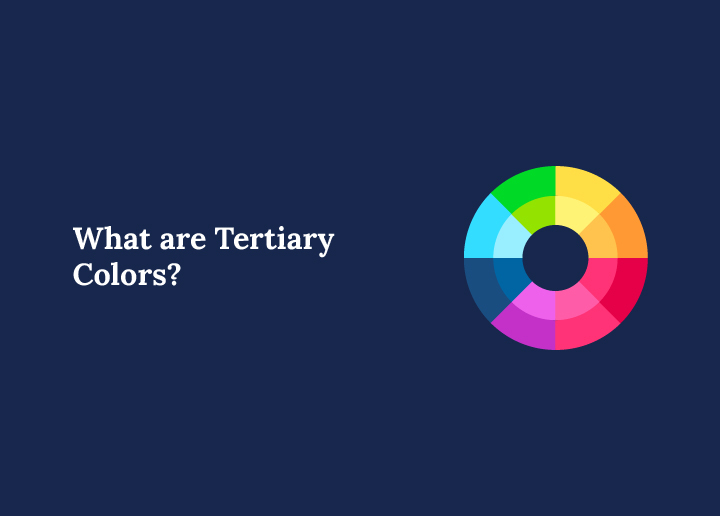
In web design, tertiary colors are created by mixing primary and secondary colors. This results in six distinct hues: red-orange, yellow-orange, yellow-green, blue-green, blue-purple, and red-purple. Tertiary colors provide a rich palette, adding depth and sophistication to designs. They allow designers to experiment with more nuanced and complex color schemes, enhancing creativity and visual interest.
How to Use Tertiary Colors in Web Design?
With Tertiary colors, designers can enhance visual interest, highlight key design elements, and achieve a balanced composition that captivates users. Here are a few strategies for using them.
- Create Visual Interest: Tertiary colors can add subtle variations and complexity to a design. Use them to make your website appear more dynamic and engaging.
- Highlight Key Elements: These colors are perfect for accentuating important elements like buttons, links, or notifications. They draw the user’s eye without overpowering the overall website design.
- Develop Unique Palettes: Tertiary colors can help create a distinctive color palette. They enable uniqueness and customization, setting your website apart from standard designs.
- Balance and Contrast: Use tertiary colors to balance bright primary colors and enhance contrast. This ensures that the content is easy to read and visually appealing.
Find out the: Benefits of Custom WordPress Website Design
Colorful Chaos to Harmonious Web Wonders!
Turn chaos into harmonious web wonders with our expert WordPress web design solutions and watch your website transform into a captivating masterpiece!
Tips for Choosing the Right Tertiary Colors in Web Design
To craft a visually engaging and cohesive web design, choosing the right tertiary colors is important. These nuanced hues can enhance your brand’s identity while offering versatility across design elements. Consider the following tips to make well-informed color choices.
Use the Color Wheel
Understanding the color wheel is crucial for effectively incorporating tertiary colors into your web design. The wheel demonstrates how colors relate to each other, helping you identify which tertiary colors will complement or contrast with your primary and secondary palette. By choosing harmonious combinations such as split-complementary or triadic color schemes, you can create a balanced and aesthetically pleasing design that captures users’ attention.
Consider Brand Personality
Your website’s colors should reflect your brand’s personality and tone. Tertiary colors offer more subtle and sophisticated options for conveying specific emotional messages. For instance, a brand focused on innovation might incorporate blue-purple to suggest creativity, while red-orange could enhance a feeling of excitement and action. Make sure the tertiary colors you select align with and reinforce your brand’s core values and strategic messaging.
Focus on Usability
It’s important to maintain usability and readability when incorporating tertiary colors, especially for text and icons. This involves ensuring high contrast ratios between background and foreground elements to meet accessibility standards. Colors should be easy on the eyes and not strain the viewer. Testing for usability also includes evaluating how your color choices perform on different devices and under various lighting conditions to ensure broad accessibility.
Leverage Design Tools
Design tools like Color Hunt are invaluable for exploring tertiary color schemes. These tools allow you to experiment with different combinations and instantly visualize their application in your design. They provide pre-made palettes and the flexibility to tweak shades and tones, making it easier to find harmonious and appealing schemes that fit your design needs.
Test in Different Contexts
It’s important to test your tertiary colors in different contexts to ensure that they are versatile across various design elements. See how these colors perform in elements like buttons, backgrounds, and headers under different lighting conditions and screen sizes. This will help you determine if the colors maintain their impact and legibility, ensuring a consistent user experience for all visitors.
In Summary
Tertiary colors offer web designers a sophisticated way to enrich their visual palettes. They provide the nuances needed to create engaging and distinctive websites. By carefully choosing the right tertiary colors, designers can achieve a balance that enhances usability and aligns with the brand’s identity.
FAQs About Web Design Tertiary Colors
What distinguishes tertiary colors from primary and secondary colors?
Tertiary colors are formed by mixing a primary color with a secondary color, resulting in more complex hues.
How do tertiary colors influence user engagement?
They add depth and variation, making designs visually interesting and keeping users engaged.
Can tertiary colors be used as primary colors in a design?
Yes, tertiary colors can dominate a design if they align with the brand’s identity and design goals.
How can I ensure tertiary colors are accessible?
Use accessibility tools to test for color contrast and visibility across different devices and lighting conditions.